“Instead of art I have taught philosophy. Though technique for me is a big word, I never have taught how to paint. All my doing was to make people to see.”
-Josef Albers
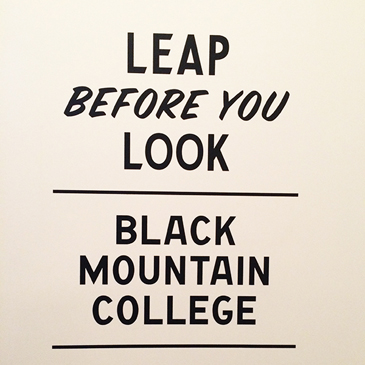
On Sunday I spent the afternoon with my mom at the Institute of Contemporary Art in Boston, viewing their latest exhibit “Leap Before You Look: Black Mountain College 1933-1957”. Years ago I worked at the ICA – first as a visitor’s services assistant (gallery monitor) and later selling tickets at the front desk. Despite the lower back pain I experienced from standing on a concrete floor for 8 hours at a time, the ICA is still a special place for me and their latest exhibit did not disappoint.
Leap Before You Look presents the history and the work created at Black Mountain College during the school’s 24-year lifespan. I’m not going to get into a detailed review of the show because The Boston Globe and The New Yorker have already done so better than I can. I will give a little context though. Black Mountain College was founded by Andrew Rice in 1933 and was not, in fact, an art school – but rather a liberal arts college which placed art at the center of its’ curriculum. The school was headed by Josef Albers and ultimately produced many of the most influential artists of post-war America.
As I made my way through the show, I was struck by the number of famous names I recognized from my own study of art and art history (Josef & Anni Albers, Robert Rauschenberg, John Cage, Merce Cunningham, Willem & Elaine de Kooning, Robert Motherwell and Susan Weil to name just a few). While many of the works in the exhibit read as finished pieces by established artists, others have the distinct feel of being a student project. The pieces range from painting to sculpture to poetry to dance and everything seems to reflect the free-form spirit of the institution itself.
Below are a few pictures I took during my visit (back when I worked at the ICA, visitors weren’t allowed to photograph any on-loan artwork but luckily they’ve relaxed this policy). The exhibit runs through January 24 and I absolutely encourage anyone and everyone to visit. The museum is free on Thursday evenings from 5-9pm!
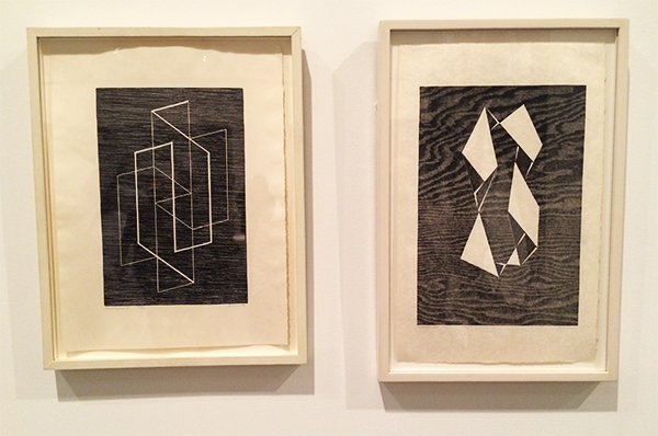
Josef Albers, Multiplex

Josef Albers, Encircled

This was a color study that Josef Albers required his students to perform. As an undergraduate studio art major I had to complete a similar assignment. As I mentioned this to my mom while viewing the piece, a woman next to us said to her friend “they’re still doing this in art school!”
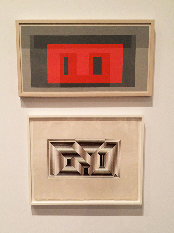
Josef Albers, Variants


Ruth Asawa, Untitled Sculpture
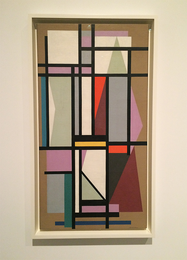
Ilya Bolotowsky, Upright in Gold and Violet
Pat Passlof, Yardstick
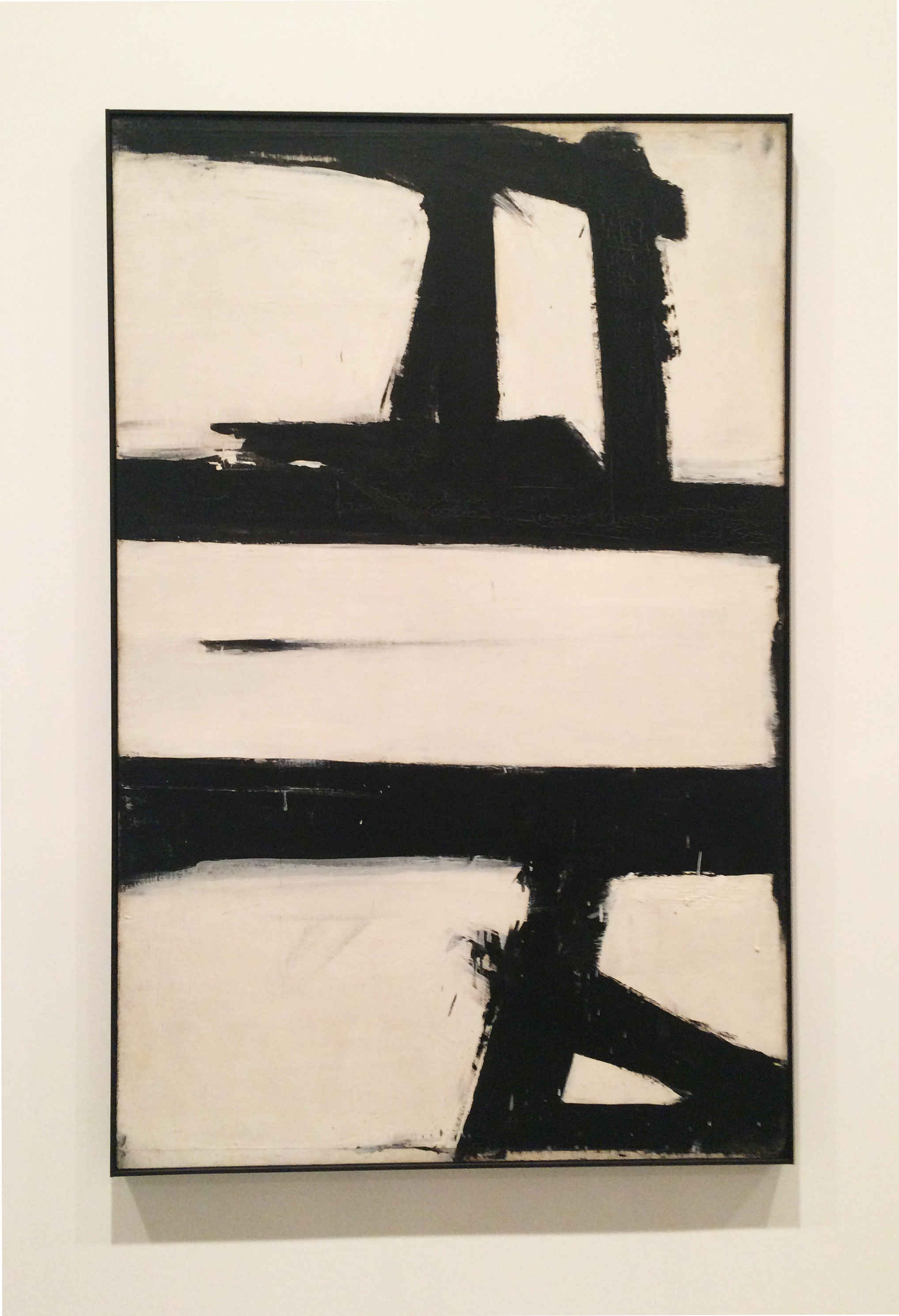
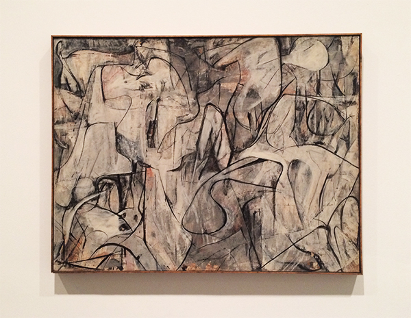
Franz Kline, Painting, 1952
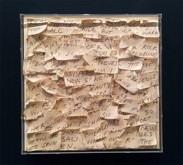
Susan Weil, Secrets
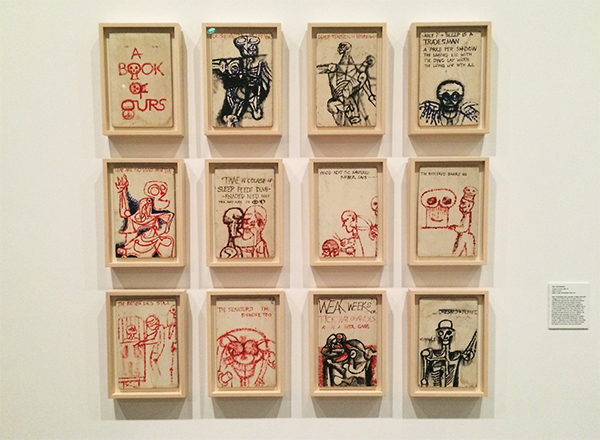
Stan VanDerBeek, A Book of Ours
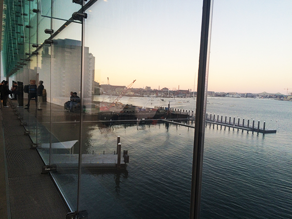
Come for the art, stay for the view.