summer of love at the mfa boston.

“One pill makes you larger And one pill makes you small And the ones that mother gives you Don’t do anything at all Go ask Alice When she’s ten feet tall”
– Jefferson Airplane, White Rabbit

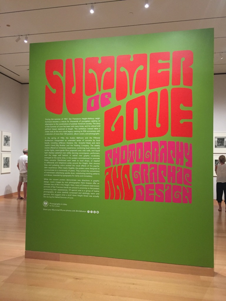
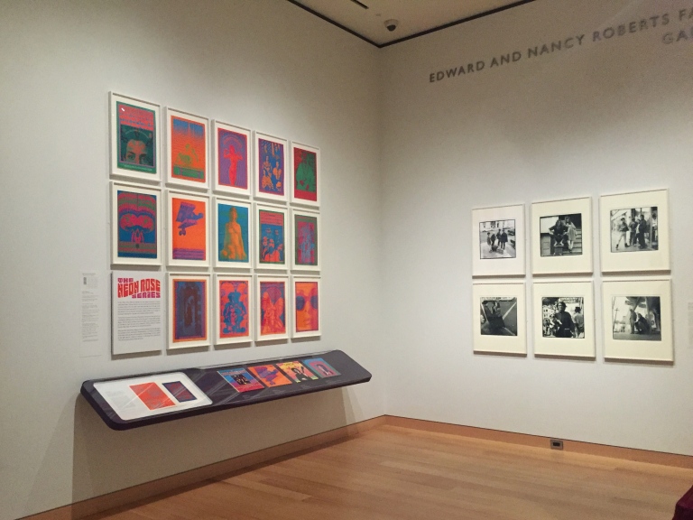
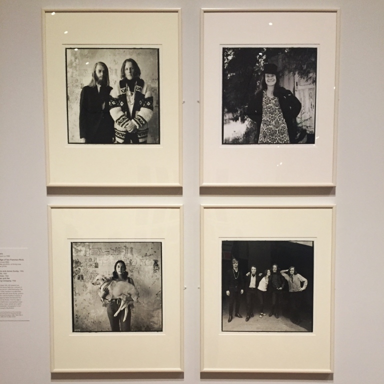
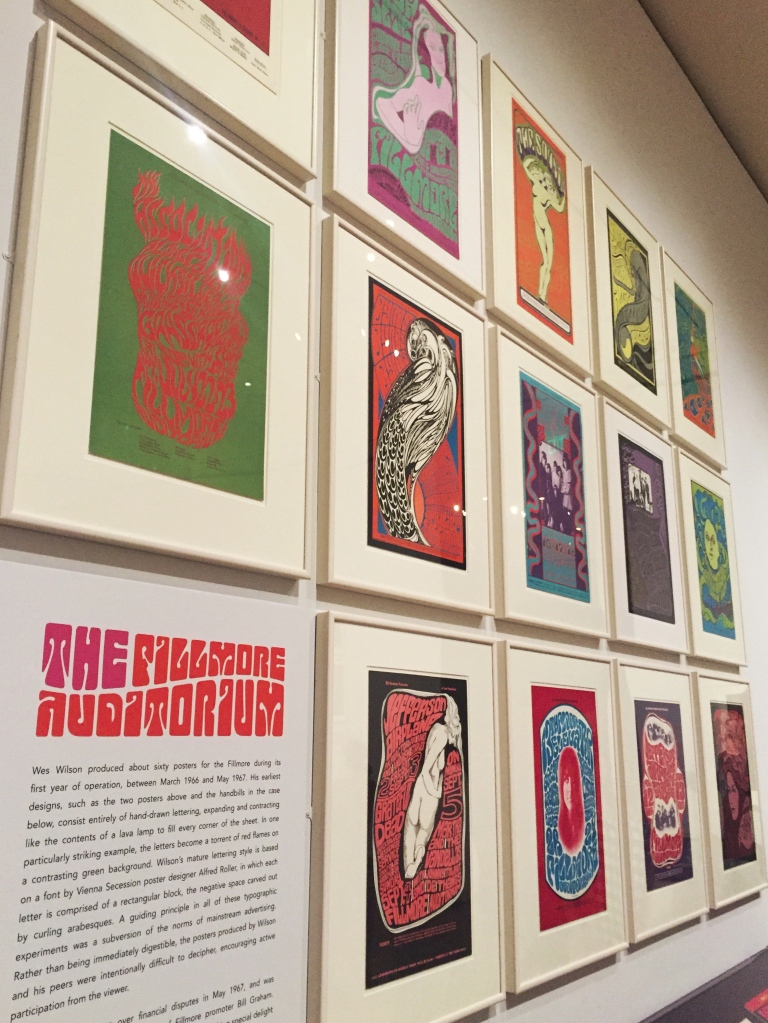
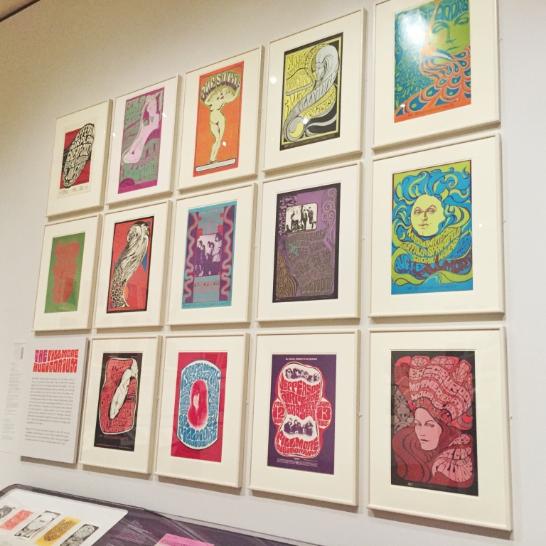
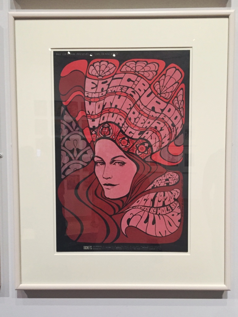
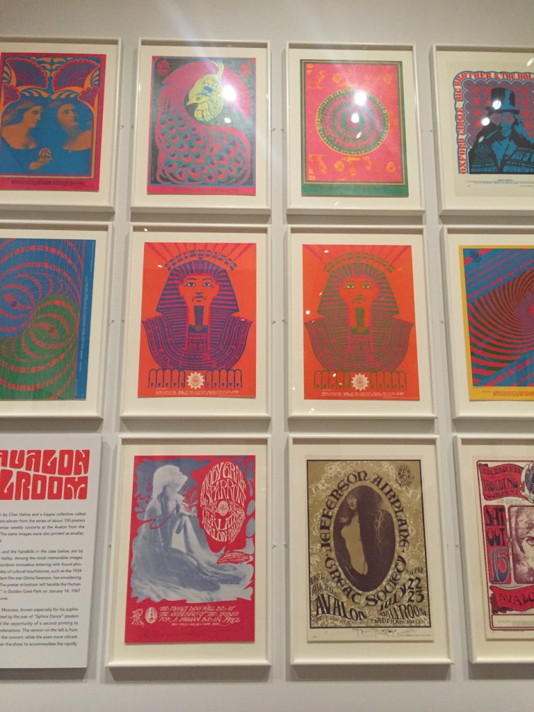
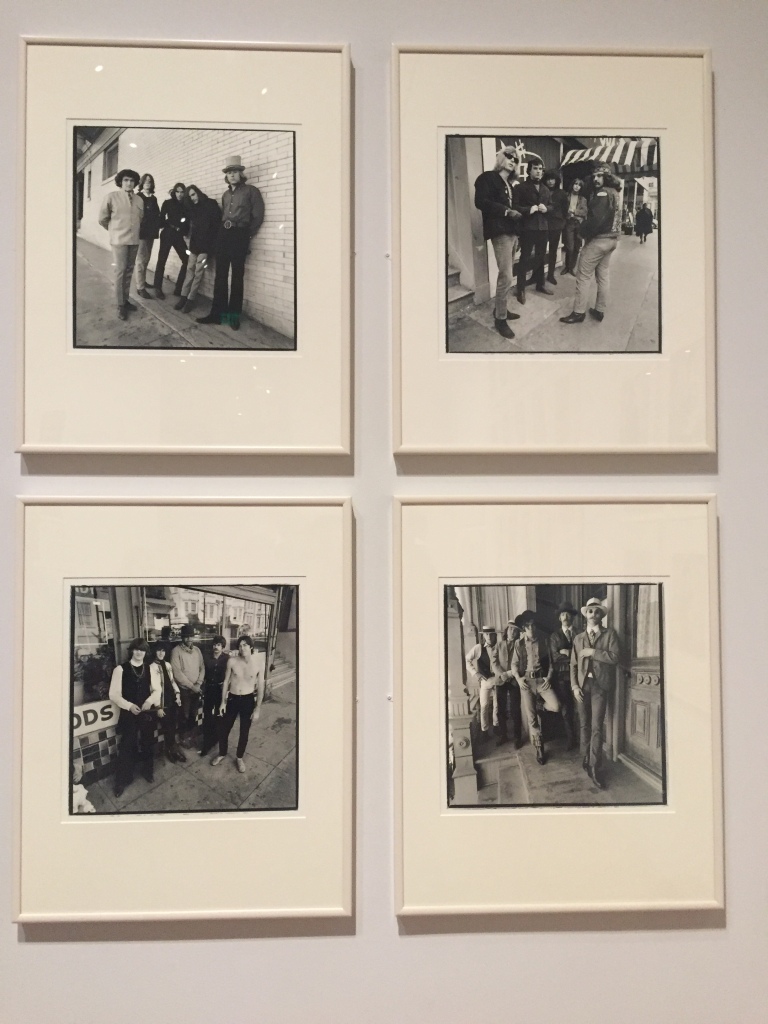
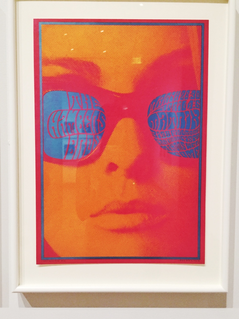
Over the weekend I had the pleasure of visiting “The Summer of Love: Photography and Graphic Design” exhibit, currently showing at Boston’s Museum of Fine Arts. The exhibit, on view until October 22, celebrates the 50th anniversary of the iconic Summer of Love in San Francisco’s Haight-Ashbury neighborhood. Visitor’s can take in more than 120 posters, album covers and photographs that center around the artists, albums and performances of an iconic moment in culture and music.

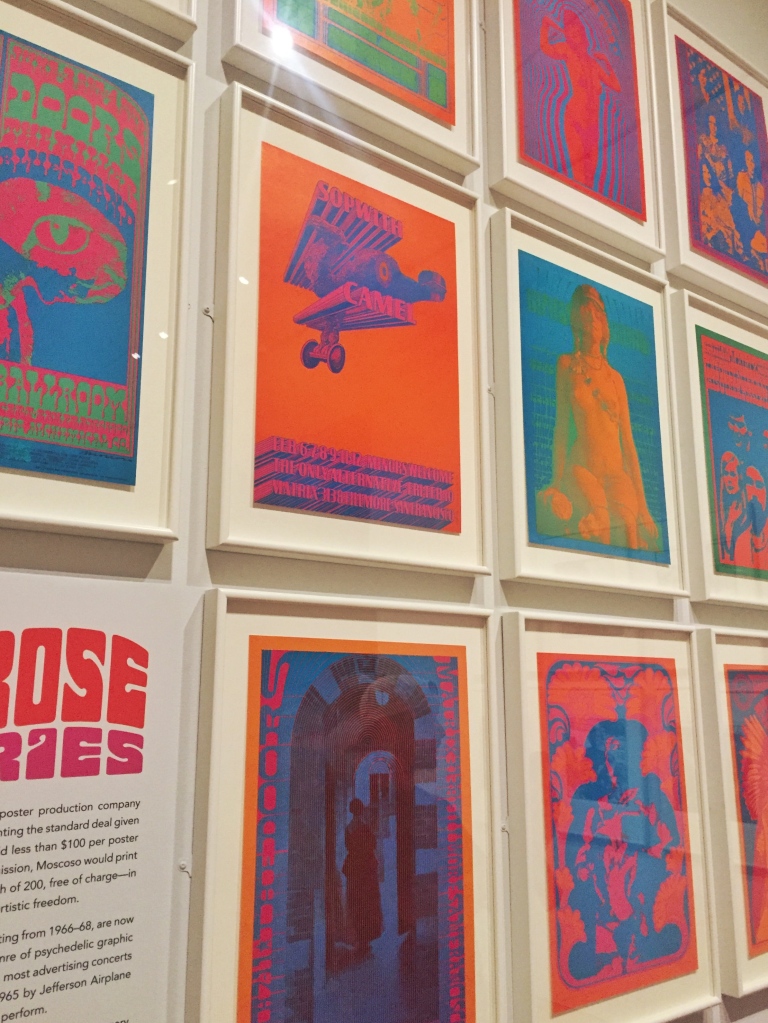
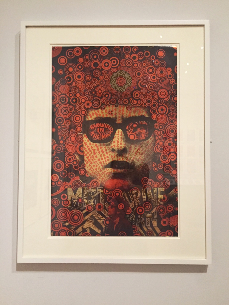
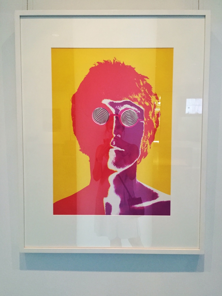
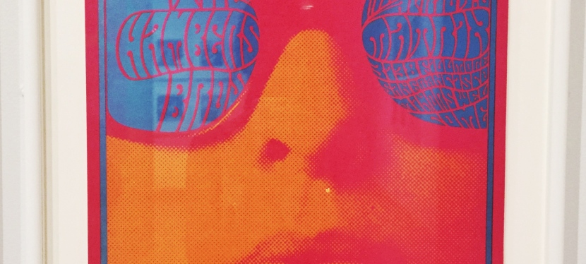
As a student of graphic design, I was particularly interested in the trends that emerged at this time around typography. Throughout the exhibit, visitors can see a trend in type which mimics the movement of lava lamps and sets reverberating colors in contrast on both album covers and concert posters. This effect is used deliberately and forces readers to engage more closely with the art in order to read words on the page. As a web designer, I know the effort that is spent in today’s digital media to ensure contrast and legibility standards so it struck me that 50 years ago the design trends of the moment encouraged just the opposite.

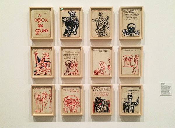
The MFA and their contributors generously allow visitors to use photography throughout the exhibit, and encourage sharing via social media (#SummerOfLove). I took a handful of photos while there which I’ve shared below. Enjoy!

IMG_6118
FullSizeRender 3FullSizeRender 4FullSizeRender 5
FullSizeRender 10FullSizeRender 6FullSizeRender 7FullSizeRender 8FullSizeRender 9FullSizeRender 11IMG_6120
IMG_6121
FullSizeRender 2

diana: her fashion story.

“There are loads of movie stars and celebrities but there will be only one Diana.”
– Elizabeth Emanuel

As mentioned in my last post, I spent the last weekend of March visiting a friend in London. Our one museum-y outing was a visit to Kensington Palace to see the current exhibit of Princess Diana’s most famous couture. The curators did a great job of detailing Diana’s style evolution and her relationship with the designers whose work she championed. The exhibit was really crowded, even during a week day, but I was able to get a few photos while I was there. Enjoy!

FullSizeRender 7

FullSizeRender 3FullSizeRender 6

FullSizeRender 8FullSizeRender 10FullSizeRenderFullSizeRender 4FullSizeRender 5FullSizeRender 9

leap before you look – a visit to the ICA.

“Instead of art I have taught philosophy. Though technique for me is a big word, I never have taught how to paint. All my doing was to make people to see.”

-Josef Albers

On Sunday I spent the afternoon with my mom at the Institute of Contemporary Art in Boston, viewing their latest exhibit “Leap Before You Look: Black Mountain College 1933-1957”. Years ago I worked at the ICA – first as a visitor’s services assistant (gallery monitor) and later selling tickets at the front desk. Despite the lower back pain I experienced from standing on a concrete floor for 8 hours at a time, the ICA is still a special place for me and their latest exhibit did not disappoint.

Leap Before You Look presents the history and the work created at Black Mountain College during the school’s 24-year lifespan. I’m not going to get into a detailed review of the show because The Boston Globe and The New Yorker have already done so better than I can. I will give a little context though. Black Mountain College was founded by Andrew Rice in 1933 and was not, in fact, an art school – but rather a liberal arts college which placed art at the center of its’ curriculum. The school was headed by Josef Albers and ultimately produced many of the most influential artists of post-war America.

As I made my way through the show, I was struck by the number of famous names I recognized from my own study of art and art history (Josef & Anni Albers, Robert Rauschenberg, John Cage, Merce Cunningham, Willem & Elaine de Kooning, Robert Motherwell and Susan Weil to name just a few). While many of the works in the exhibit read as finished pieces by established artists, others have the distinct feel of being a student project. The pieces range from painting to sculpture to poetry to dance and everything seems to reflect the free-form spirit of the institution itself.

Below are a few pictures I took during my visit (back when I worked at the ICA, visitors weren’t allowed to photograph any on-loan artwork but luckily they’ve relaxed this policy). The exhibit runs through January 24 and I absolutely encourage anyone and everyone to visit. The museum is free on Thursday evenings from 5-9pm!

image2_Albers
Josef Albers, Multiplex

image3_Albers
Josef Albers, Encircled

image4
This was a color study that Josef Albers required his students to perform. As an undergraduate studio art major I had to complete a similar assignment. As I mentioned this to my mom while viewing the piece, a woman next to us said to her friend “they’re still doing this in art school!”

image5
Josef Albers, Variants

image6

image7_portrait

image14_sculpture
Ruth Asawa, Untitled Sculpture


image8
Ilya Bolotowsky, Upright in Gold and Violet


image9

Pat Passlof, Yardstick

image10

Franz KlinePainting, 1952

image11_secrets
Susan Weil, Secrets

image12
Stan VanDerBeek, A Book of Ours

image13_view
Come for the art, stay for the view.