summer of love at the mfa boston.

“One pill makes you larger And one pill makes you small And the ones that mother gives you Don’t do anything at all Go ask Alice When she’s ten feet tall”
– Jefferson Airplane, White Rabbit

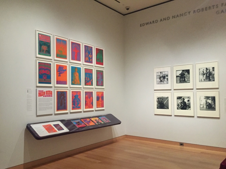
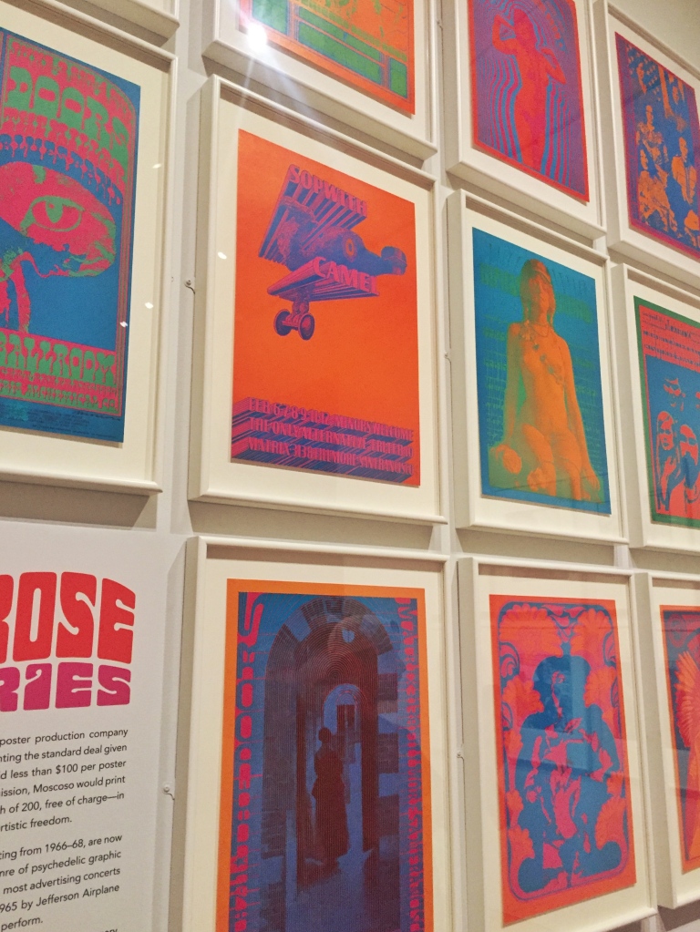
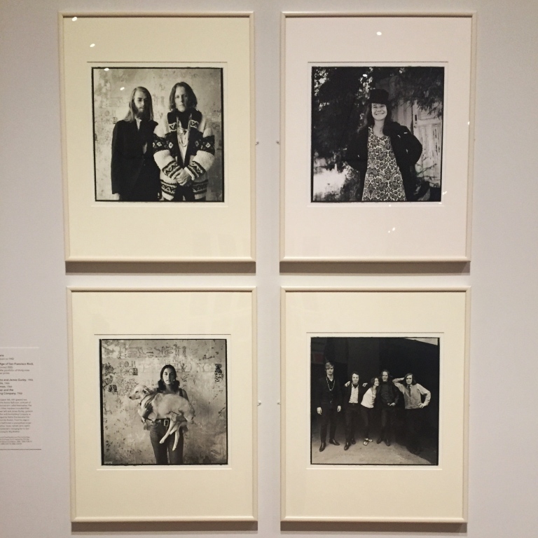
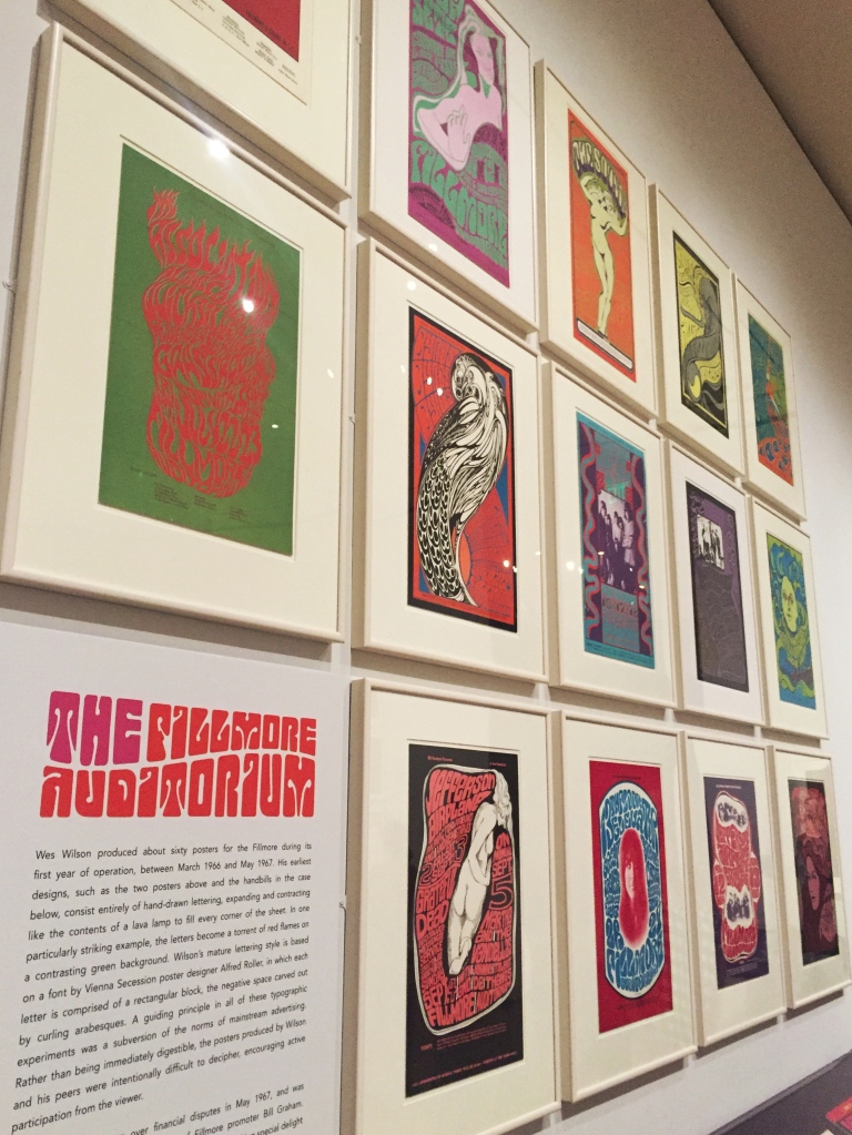
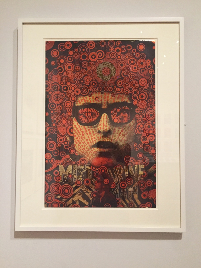
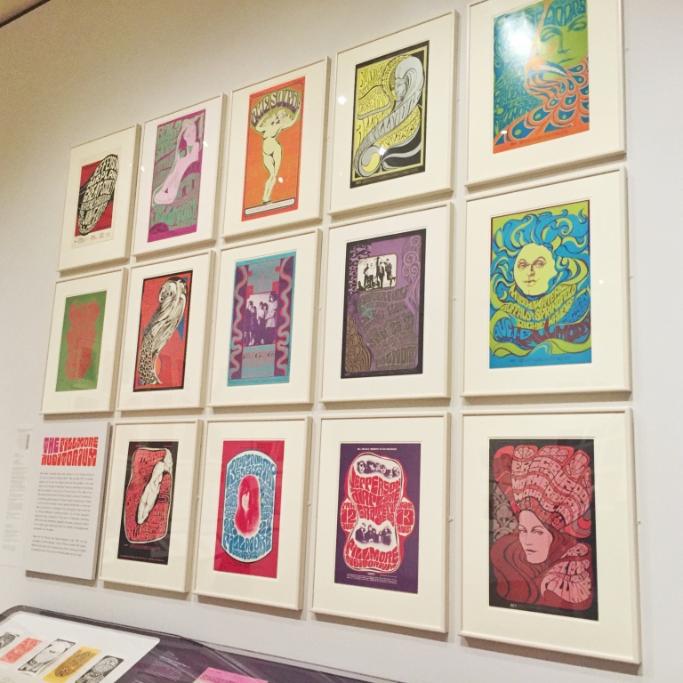
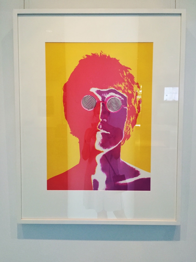
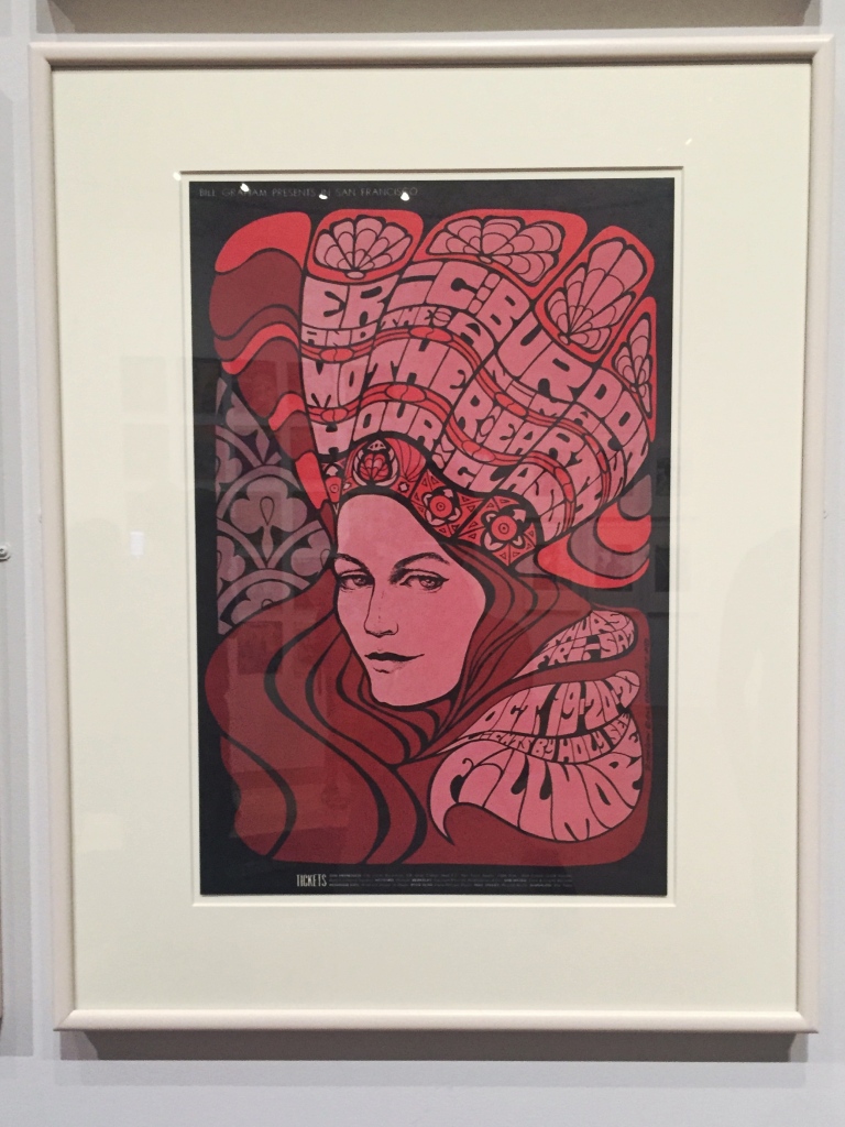
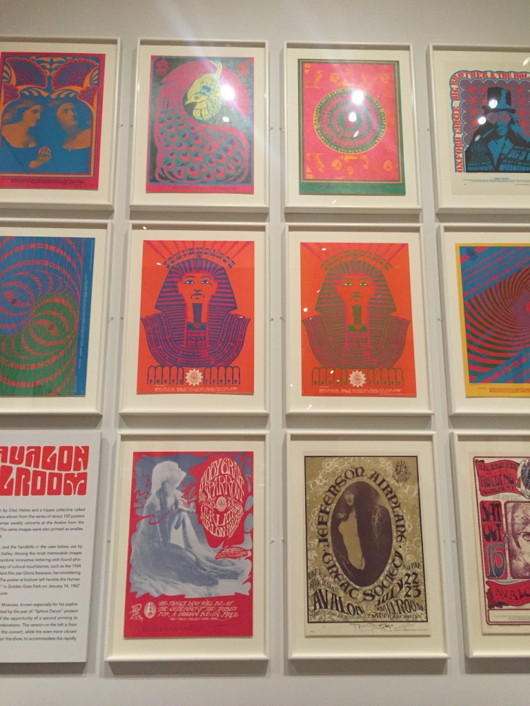
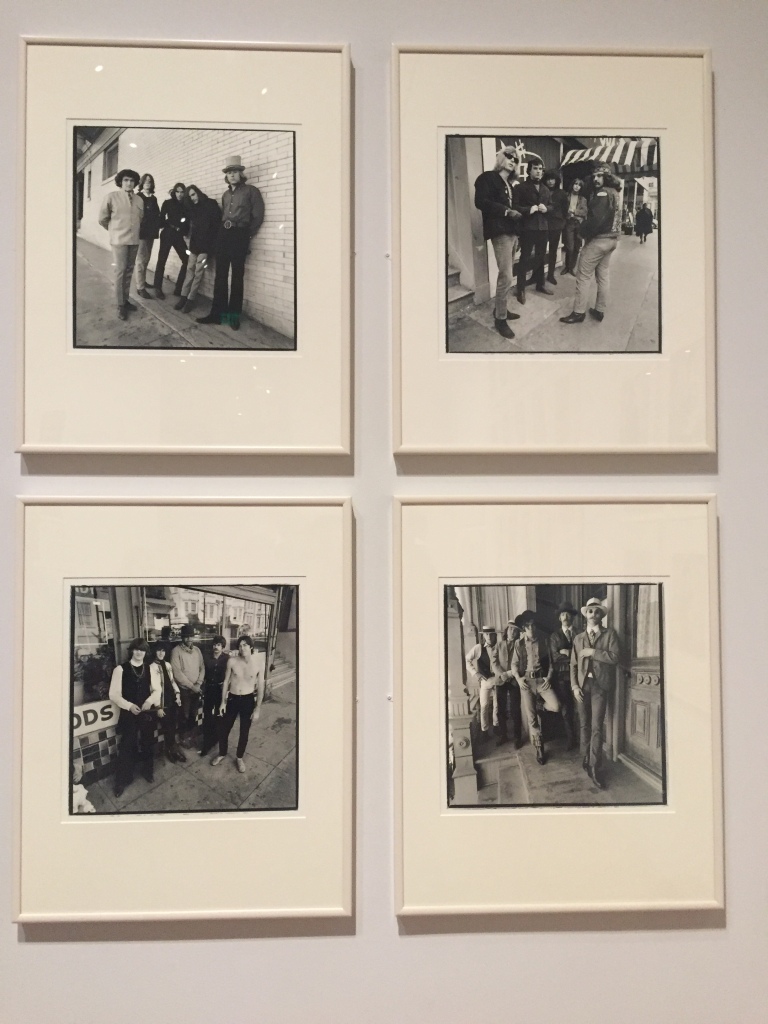
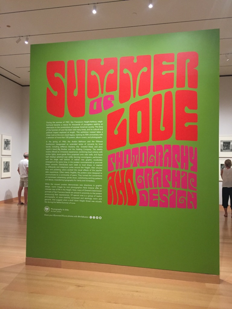
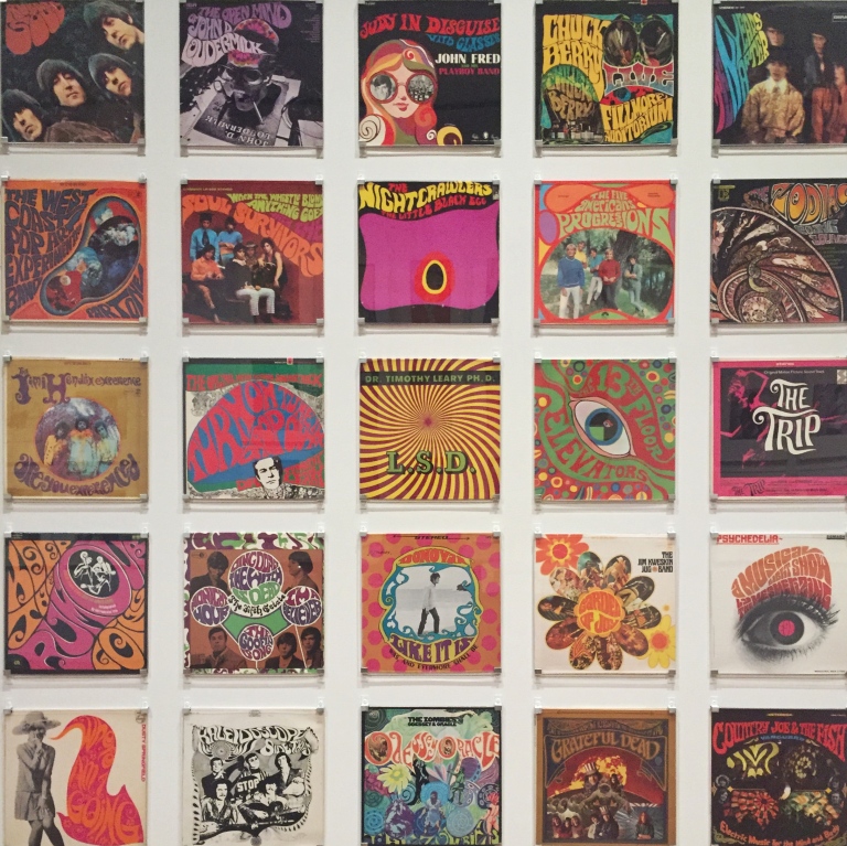
Over the weekend I had the pleasure of visiting “The Summer of Love: Photography and Graphic Design” exhibit, currently showing at Boston’s Museum of Fine Arts. The exhibit, on view until October 22, celebrates the 50th anniversary of the iconic Summer of Love in San Francisco’s Haight-Ashbury neighborhood. Visitor’s can take in more than 120 posters, album covers and photographs that center around the artists, albums and performances of an iconic moment in culture and music.

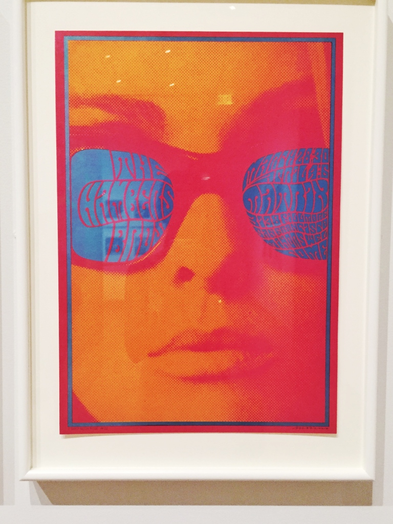
As a student of graphic design, I was particularly interested in the trends that emerged at this time around typography. Throughout the exhibit, visitors can see a trend in type which mimics the movement of lava lamps and sets reverberating colors in contrast on both album covers and concert posters. This effect is used deliberately and forces readers to engage more closely with the art in order to read words on the page. As a web designer, I know the effort that is spent in today’s digital media to ensure contrast and legibility standards so it struck me that 50 years ago the design trends of the moment encouraged just the opposite.

The MFA and their contributors generously allow visitors to use photography throughout the exhibit, and encourage sharing via social media (#SummerOfLove). I took a handful of photos while there which I’ve shared below. Enjoy!
IMG_6118
FullSizeRender 3FullSizeRender 4FullSizeRender 5
FullSizeRender 10FullSizeRender 6FullSizeRender 7FullSizeRender 8FullSizeRender 9FullSizeRender 11IMG_6120
IMG_6121
FullSizeRender 2

jules besch stationers – truro, ma.

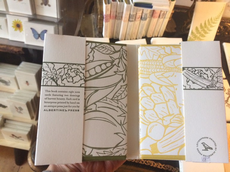
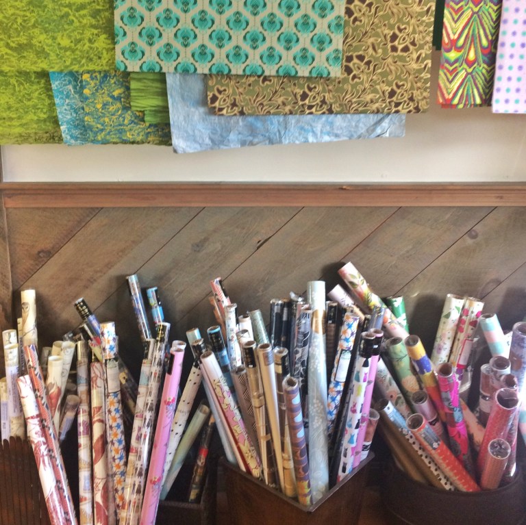
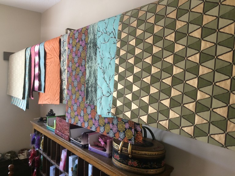
Another post from my most recent visit to Cape Cod. Jules Besch Stationers was formerly located in Wellfleet center, and now occupies a charming cottage-like space in Truro. The shop specializes in all kinds of paper goods including cards, notebooks, calendars and wrapping paper. On the day I visited the owner happened to be hosting his 18th annual afternoon tea which meant there were lots of delicious treats (and tea of course). There are so many beautiful and unique things to see at this store. Sharing some photos of the shop below.

img_5003img_0006img_4996img_4988Processed with Snapseed.img_4998img_0005

how common is your birthday?

Ever wondered how many people share your birthday? Andy Kriebel, the self-described “Tableau Zen Master”, recently combined data from the New York Times and  blogger, Matt Stiles, to create an interactive chart all about birthdays. The heat map below uses a color spectrum to illustrate just how common each birthday really is. While I was a little disappointed to know that my own birthday in July is not all that rare, I found this chart really interesting and a great example of data visualization. Hope you enjoy!


Most Common Birthdays

var divElement = document.getElementById(‘viz1471525922792’); var vizElement = divElement.getElementsByTagName(‘object’)[0]; vizElement.style.width=’604px’;vizElement.style.height=’669px’; var scriptElement = document.createElement(‘script’); scriptElement.src = ‘https://public.tableau.com/javascripts/api/viz_v1.js’; vizElement.parentNode.insertBefore(scriptElement, vizElement);

melanie & jason weding invitations.

I recently had the privilege to design a wedding invitation for my good friends Melanie and Jason. Melanie was my freshman year roommate at Providence College and I’ve been fortunate to call her a friend ever since. In October of this year Melanie and Jason will marry at the Glen Cove Mansion in New York. The bride asked that the invitations reflect the elegance and historic nature of this Georgian-style estate that will be their venue.

Invitation suite

type pairings from around the web.

cover image

Like most graphic designers I have a special place in my heart for typography. Whether designing a website or a wedding invitation, one of the most time-consuming challenges for me can be finding two typefaces that really compliment one another. This article by designmodo offers some really well-excuted type pairings from around the web. I’m especially loving the Europa/Garamond pairing from exposure.co.