throw pillow refresh.

A couple weeks ago I decided that I was tired of the throw pillows in my living room and that it was time for a refresh. Pillow covers can range from super cheap to incredibly expensive. Because I like to change mine out every couple years, I try to seek out a good bargain and wanted to share what I found.

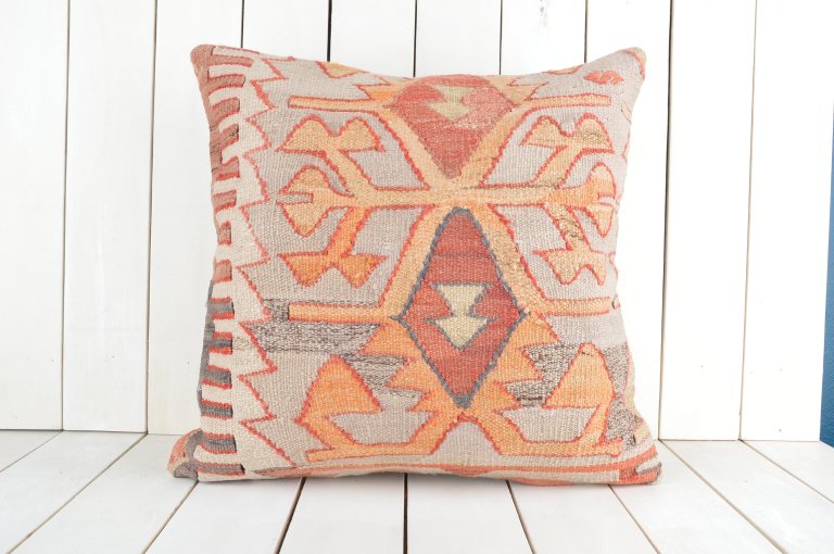
As I’ve mentioned on this blog before, I’ve been really inspired by kilim style textiles that have recently come back en vogue. I wanted at least one of the pillow covers to be a kilim textile, but, they can be incredibly expensive. Last year I purchased a vintage area rug on Etsy and so I was aware of their vast inventory of vintage goods. I took my search to Etsy once again and was not disappointed. After scrolling through many options, I settled on a 20×20 inch Turkish Kilim pillow from orcunshop. The price was very reasonable ($40) and the shipping was incredibly fast.

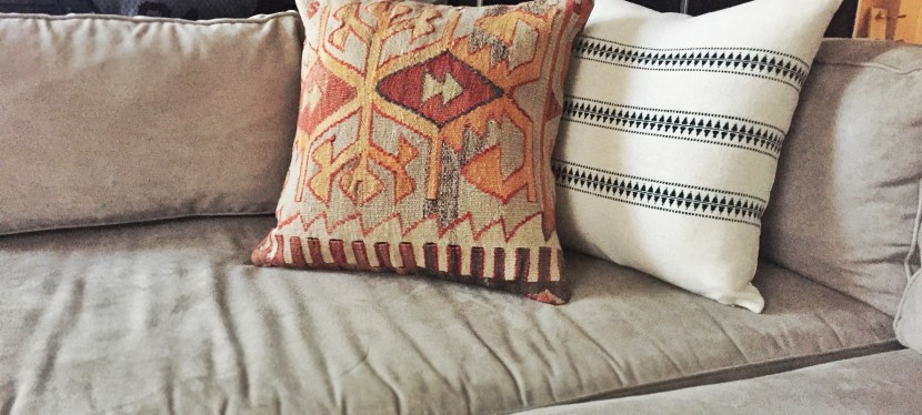
Because the Etsy cover was fairly ornate, I though the second pillow should probably feel a bit more neutral and understated. Last year H&M launched a home decor line and I’ve been really impressed by their overall aesthetic — plus their products are always extremely affordable. The pillow I bought their doesn’t appear to be on their website (perhaps it’s an in-store only item?) but it was very reasonably priced at $17.00.

I’ve shared a couple photos of both pillows below. If you’re ever looking for an affordable throw pillow refresh, Etsy and H&M are highly recommended resources 🙂

FullSizeRenderFullSizeRender 2pillow

rooms with lucite furniture.

Lucite furniture seems to be having a moment. For a couple of years now I’ve noticed this modern material appearing all over design magazines and blogs. Though lucite furniture can be found in a variety of colors, it’s the clear glass-looking items that I’ve seen popping up in the portfolios of designers and stylists. In its transparent form, lucite reads as a neutral and can add a glamorous and modern feel to a space. Below, I’ve collected some of my favorite examples of lucite furniture from around the web. Enjoy!

6KatieMedina-142
design chic


beckiowens
Becki Owens


drivenbydecor
Driven by Decor


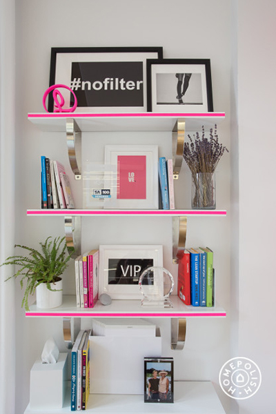
homepolish
Homepolish


KatieKime_2.
Katie Klime


KatieKime_pinterest
Katie Klime


MW000012209
My Domain


OKL
One Kings Lane


ruemag
Rue Magazine


styleathome
style at home


styleyoursenses_ig
Design by Ceres | instagram


TEG
The Everygirl


bits of inspiration – #65.

Looks like it’s time to go out and buy that Powerball ticket! This 4,000 sq ft. penthouse condo in Boston’s Beacon Hill neighborhood has officially gone on the market and the renderings are truly incredible. As I’ve written before on this blog, the combination of modern and vintage styles are really my favorite aesthetic and it looks like the architects/designers on this project have executed this remarkably well. Check out more photos on the official property listing here.

photo courtesy of Gibson Sotheby’s International Realty


photo courtesy of Gibson Sotheby’s International Realty


photo courtesy of Gibson Sotheby’s International Realty

pairing modern chairs with vintage tables.

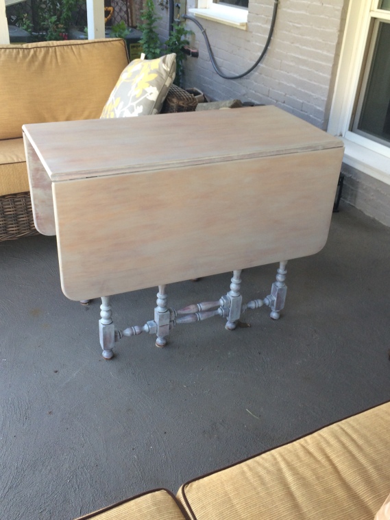
Last summer I upcycled a small table that my aunt had in storage. The table has two leaves that fold out so that it can comfortable seat 4 but can also be used as a buffet table when the leaves are down. Here’s a photo for reference:

IMG_2223

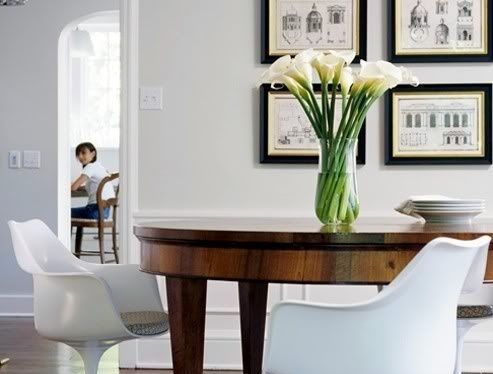
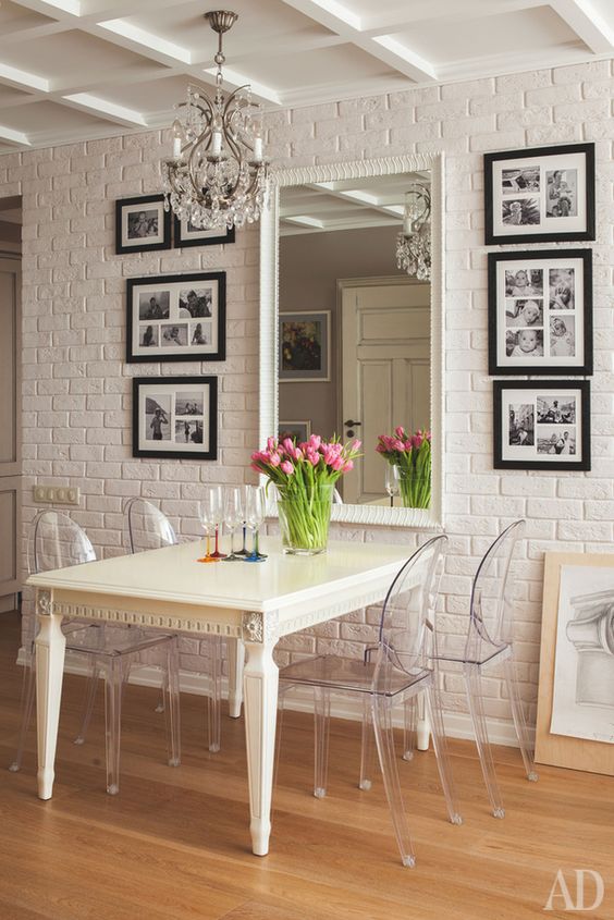
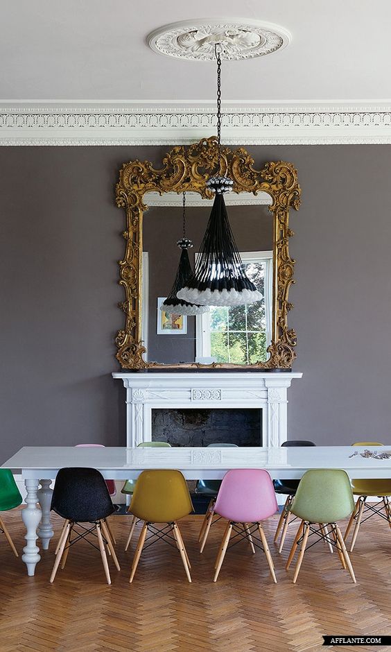
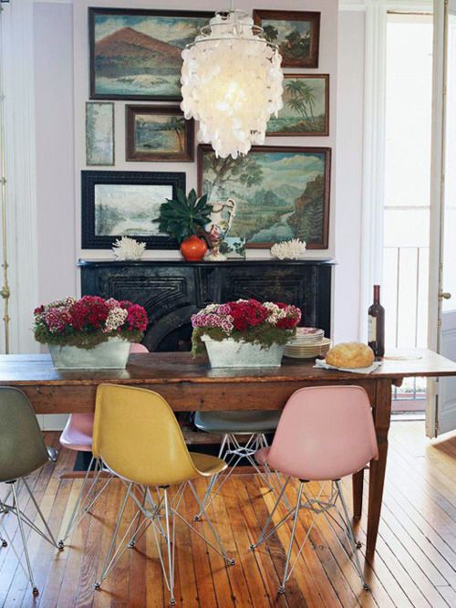
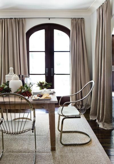
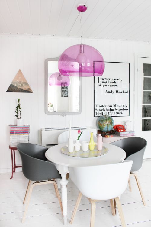
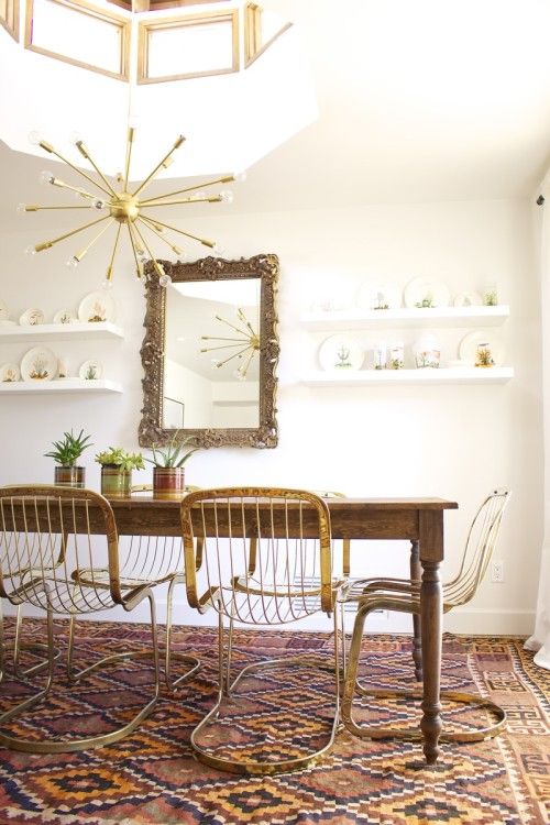
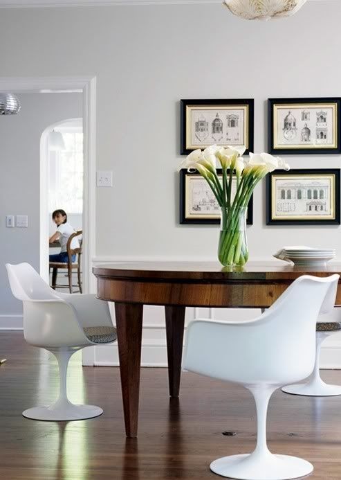
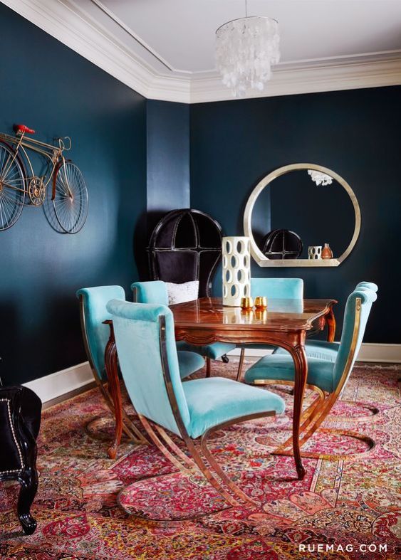
When I moved a month ago I had big plans for using this table (leaves out) as a little dining table in our new apartment. I spent a lot of time thinking about what chairs should accompany it and I was really excited for the opportunity to execute one of my favorite styles – pairing vintage and modern pieces. In the end, the table didn’t quite fit in the space the way I had hoped so this dream will have to be shelved for our next move. In the process of trying to decide on the right set of dining chairs I collected a bunch of images for inspiration that I thought I’d share anyway. Scroll down to see some of my favorite examples of modern chairs paired with vintage-style tables from around the web.

admag
Architectural Digest Russia


Afflante
Afflante


crushculddesac
Crush Cul de Sac


decorista
The Decorista


designsponge
Design Sponge


designsponge2
Design Sponge


indulgy
Indulgy


rue
Rue Magazine


rue2
Rue Magazine


thenletitbe
Her New Tribe

rooms with illustrated wallpaper.

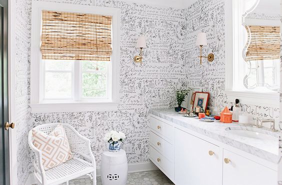
As a renter, the very idea of wallpapering a room is a far off dream for me. That hasn’t stopped me from from keeping an eye on the wallpaper trends that I’ve seen popping up around the design community as of late. One of my favorite trends of the moment is the use of illustrated wallpaper patterns. The hand-drawn feeling of these designs can really lend a more modern or whimsical feeling to a room. Check out some of my favorites below..

aptTherapy1
Emily Hendersen


Arch_digest
Architectural Digest


cb2
CB2


cocoKelly
coco + kelley


Arch_digest2
Architectural Digest


onekingslane1
One Kings Lane


onekingslane2
One Kings Lane


rue1
Rue Magazine


rue2
Rue Magazine

decorating with portraiture.

I’ve always been drawn to images of people. For as long as I can remember, images that capture something truly human an intimate about an individual have always been infinitely more interesting to me than fruit on tables or anything else really. As a college senior, when it came to choosing a subject matter for my thesis show I naturally chose to paint a series of portraits depicting my closest friends and family. When portraits of any medium are present in a room, they have they effect of feeling like real presence in your home – they become characters that you live with. Below I’ve put together a few examples of decorating with portraiture from some of my favorite design inspiration sites. Enjoy!

apartmenttherapy
Apartment Therapy


apartmenttherapy2
Apartment Therapy


architecturaldigest
Architectural Digest


blissathome
Bliss at Home


homepolish1
Homepolish


homepolish2
Homepolish


onekingslane1
One Kings Lane


onekingslane2
One Kings Lane


onekingslane3
One Kings Lane

rooms with monochromatic molding.

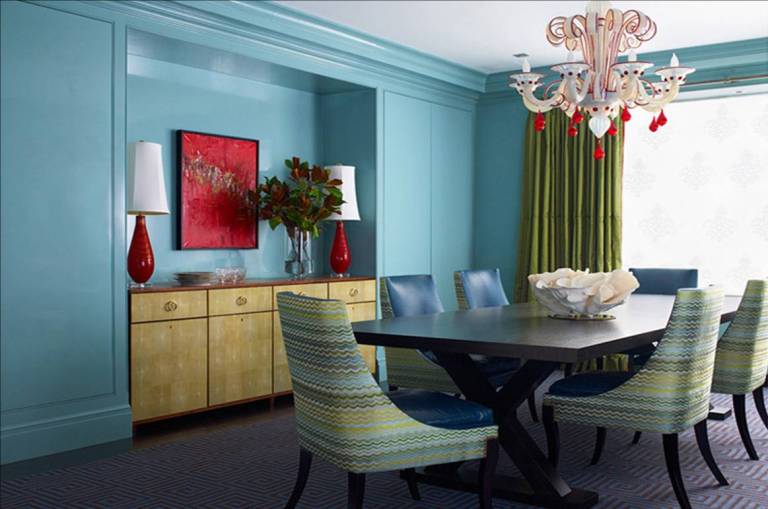
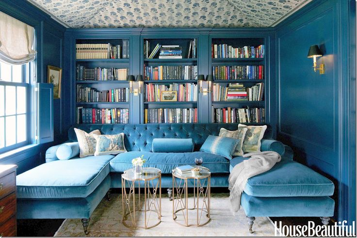
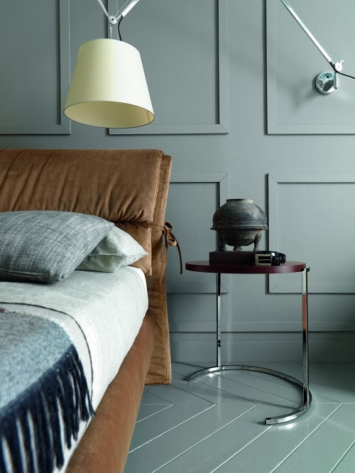
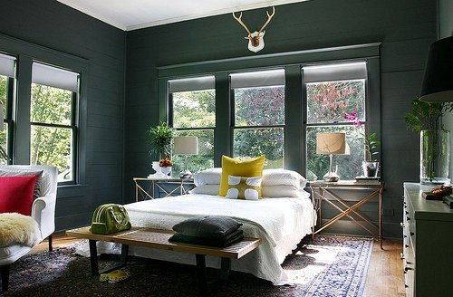
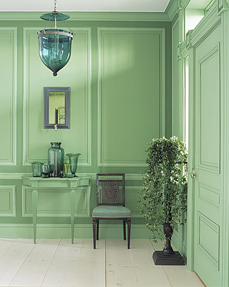
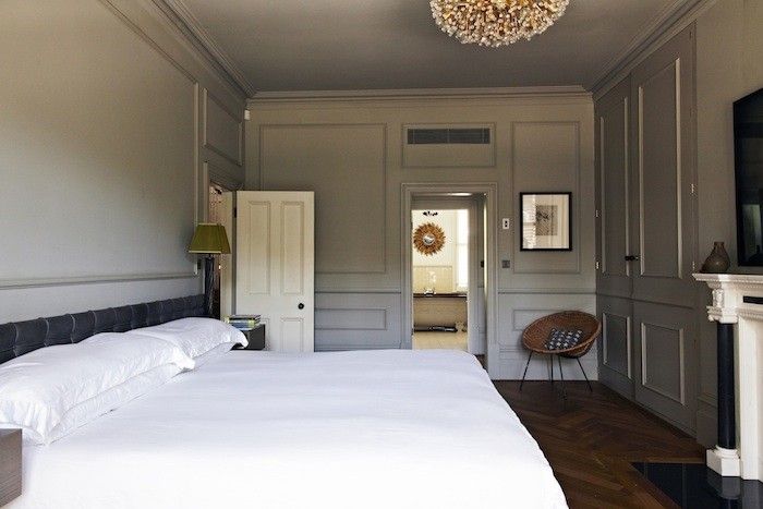
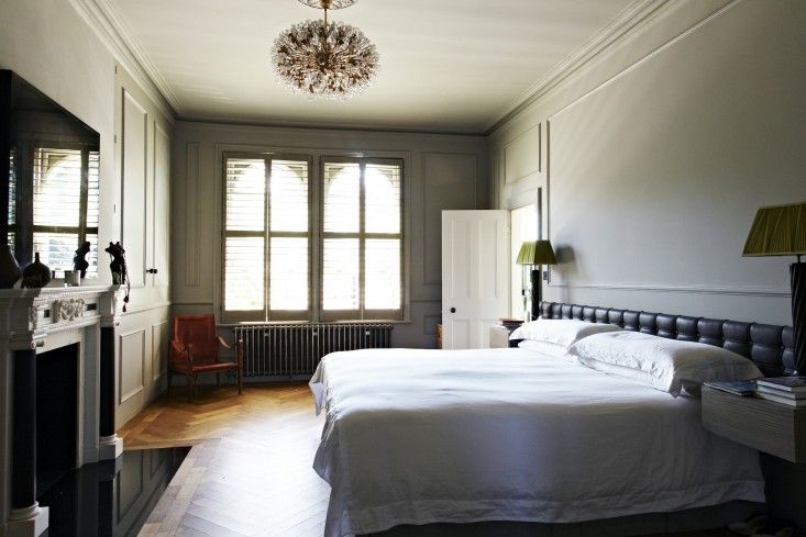
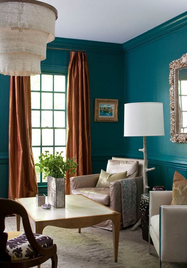
I find myself really loving the idea of monochromatic rooms lately. One trend that I’ve seen popping up around some of my favorite design sites and blogs recently is this painting of crown molding to match the walls of a room. There’s something so elegant and bold at the same time about this look that I find really satisfying. Sharing some of my favorites below – enjoy!

black-bedroom
Cote de Texas


blue-diningroom
Your Decor NYC


cobalt-livingroom
Cote de Texas


coolgrey-bedroom
houzz


darkgrey-livingroom
apartment therapy


green-foyer
Your Decor NYC


grey sofa
#MCULT


grey-bedroom
grey-bedroom1
remodelista


navy-livingroom
#MCULT


teal-parlor
#MCULT


yellow-livingroom
Fawn Chang

cohabitation – more is more.

I mentioned in an earlier post that over the summer I moved into an apartment with a boyfriend for the first time. From the moment we signed the lease I was obsessively thinking about what our shared home would look like and how our different collections of belongings would come together. I am a collector by nature and Jared is the same way. I think collections are great and important and the very thing that make a home interesting and unique. That being said, two inherent collectors of things in 675 sq. ft is a design challenge to say the least.

Compounded on top of the so-many-things issue was the fact that our apartment had so much intrinsic character to contend with. The building was constructed in 1910 and was originally a hotel. The molding throughout the apartment is large and ornate. The windowsills are a full foot deep. I would say that my personal taste has leaned toward the more contemporary for quite some time. In such an ornate and historic space a modern, minimalist aesthetic just didn’t make sense.

I’ve spent the past four months trying (with much assistance from Jared) to piece together our belongings in a way that felt true to both of us. I’ve essentially abandoned any attempts at achieving a specific design style in favor of something that feels more eclectic and more like a reflection of our tastes and our stories. We had another couple over for the first time in July after settling in a bit. Both guests remarked that our apartment felt so much like both of us and I’ve realized that this is the real mark of success in building a home. It’s still (and always?) a work in progress but I’m happy to say that we are cultivating an aesthetic of our own which has been infinitely more fun and rewarding than effectively mimicking mid-century modern, or Scandinavian minimalism or industrial loft-style or whatever. 🙂

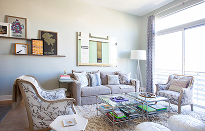
Here are some images of our apartment.

Living Room
livingroom1chairlivingroom2 shelf

I don’t always decorate with sports memorabilia but when I do it’s to honor The Big 3
corner

Bar cart I DIY’d according to this tutorial.
bar

Kitchen table
kitchen

leaning artwork.

“If you love something, it will work. That’s the only real rule.” – Bunny Williams

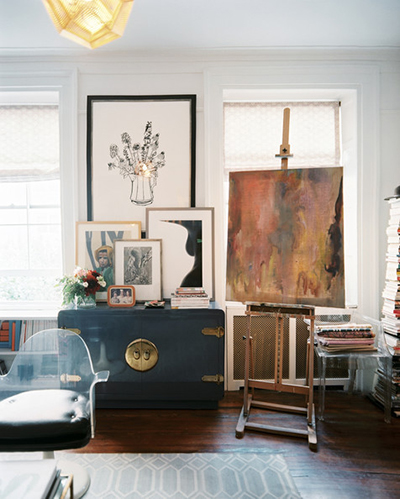
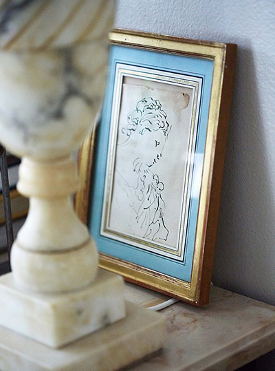
I really love the way leaning artwork can make any room feel a little bit like an artist’s loft. Especially with large pieces, I think leaning a piece of art can make a room feel more approachable while still having a polished feel. Here’s a collection of examples of leaning art – placed on floors, tables and shelves – from some of my favorite design sites.

4.lonny.com
lonny.com

2.one_kings_lane_
One Kings Lane

6.homepolish
Home Polish

5.mydomaine
mydomaine.com

14.lonny.com
lonny.com

12.homepolish
Home Polish

10.homepolish
Home Polish

1.lonny.com
lonny.com

13.arch-digest
Architectural Digest

8.homepolish
Home Polish

9.homepolish
Home Polish

3.onekingslane
One Kings Lane